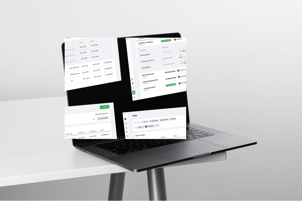
Pitched and implemented a new direction that transformed the platform from lacking vision to enhancing the overall workflow
Platform Lacks Vision and UX is Broken
Meta's Business Notification Platform sends personalized, educational notifications to Facebook business page owners, helping them build ads and grow their businesses. It adds over 500,000 active advertisers each month.
The platform had no clear vision or roadmap. Internal users needed up to four taps just to confirm a single notification's launch status.
Rebuilding a fragmented platform into one holistic, scalable experience
I led the platform redesign end to end, from UX audit through a new design system, with two goals held together. First, make the platform efficient enough that internal teams could manage notifications without friction. Second, build a structure the engineering team could keep scaling on their own. I made the case to engineering leadership to invest in the backend changes a design-led vision demanded.
Impact
95%
User satisfaction
95% of the users said that the new structure helps them to manage more efficiently. In the first month, 34% of users chose the new version and never went back to the old version.
61%
Usage Growth
Product adoption rose by 61%. The streamlined process enabled more users to engage with it instantly.
67.51
Maturity Score
Finished the year above the 66.31 goal set for the platform.
Layering a bold vision on top of incremental fixes
The biggest shift in this project was layering a bold, structural vision on top of the incremental fixes already underway.
When we took over this product, the team had no direction. We spent two months on feature iterations that never built confidence about where the product should go, because none of those fixes touched why the platform felt fragmented in the first place. I realized iterating alone wouldn't be enough: the problem sat in the information architecture itself, and it needed a structural vision on top of the fixes, not just more of them.
Championing a New Vision
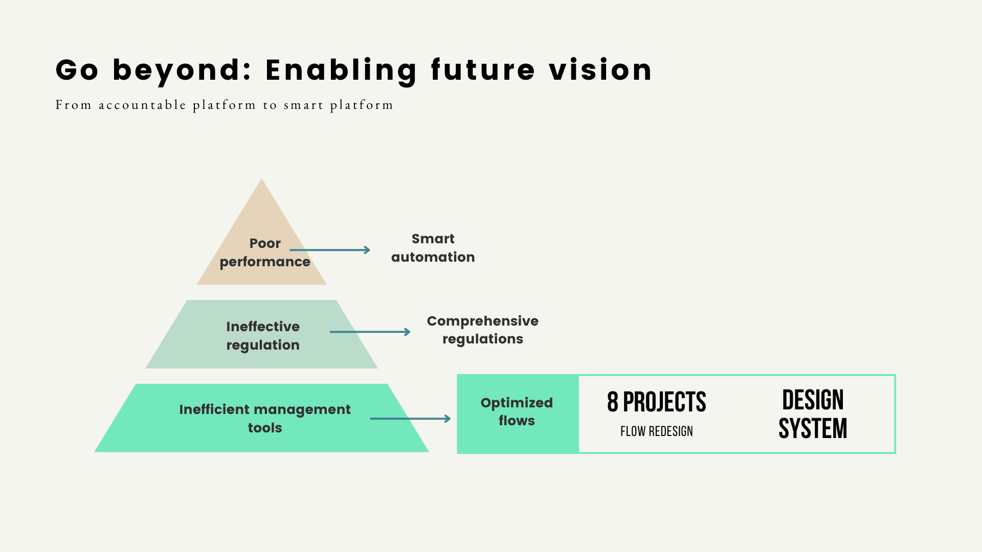
I boldly pitched and led a new direction to revamp the product into an integrated structure.
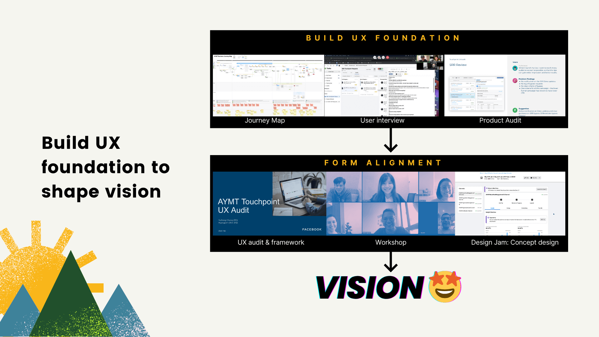
I started with research: a UX audit, a journey map, and user interviews to understand the ecosystem from the inside. Synthesizing those findings, I proposed a design vision in a workshop with the team, then worked through the concepts in a design jam. That process turned into a product design strategy framework: a prioritized list of the platform's core issues and a one-year roadmap of 8 projects, starting with the most fundamental problems first. This involvement in UX research gave the team the confidence to evaluate impact and prioritize projects, rather than continuing to guess.
Visualizing the overall concept got the team excited about the new vision, and they committed to building a comprehensive plan around it.
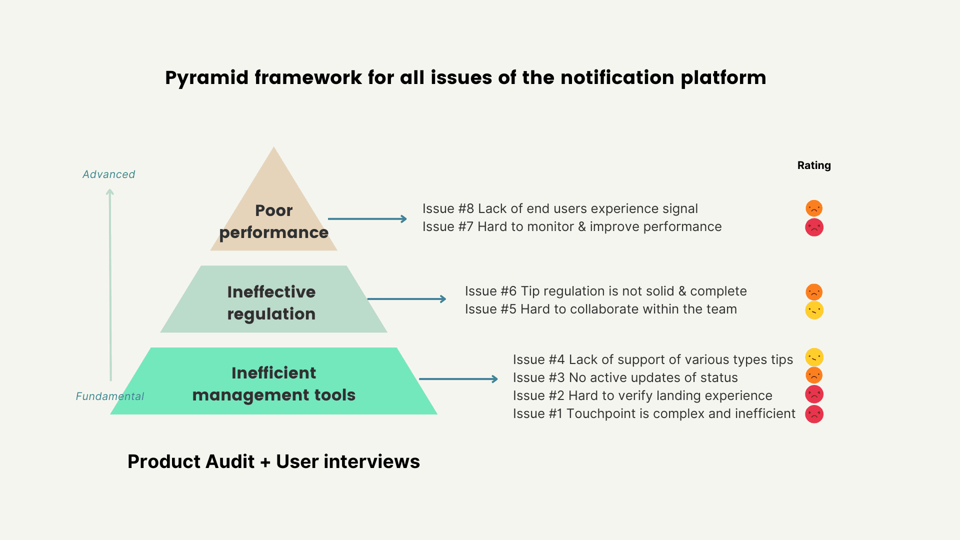
Core problem: The fragmented platform structure and unclear status are blocking the users from effectively launching notifications.
Hard to Navigate
The platform lacked a dedicated detail page, so its fragmented architecture forced users to jump between multiple pages to find information and complete a task, significantly reducing their productivity and making the experience cumbersome

Hard to Track Progress
There was a lack of clarity in notification statuses across the platform. Too many statuses were lumped together, requiring users to tap four times to figure out the accurate launch progress.

Unclear Actions
The process for launching notifications was non-linear. The confusing status made it difficult for users to understand what specific actions were needed at each stage, blocking the launch progress.

Limited Scalability
The fragmented structure and lack of design system also limited the platform team's ability to scale new features efficiently.
Rebuild a holistic platform that enhances clarity of notification statuses and actions, empowering users to manage notifications effectively.
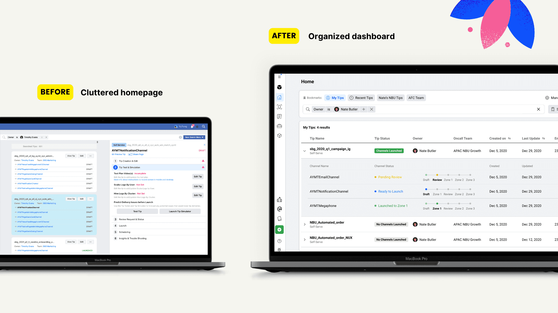
Streamline dashboard to reduce clutter, clarify notification status, and simplify navigation
The goal had two halves. Efficiency is the functional half: reduce clutter, clarify status, simplify navigation. Scale is the structural half: build something the team could keep extending without repeating the same fragmentation. Progress against the goal was tracked through task completion turnaround time, detail page usage, and the platform's maturity score.
Metrics:
Task completion TAT
Detail page usage
Maturity score
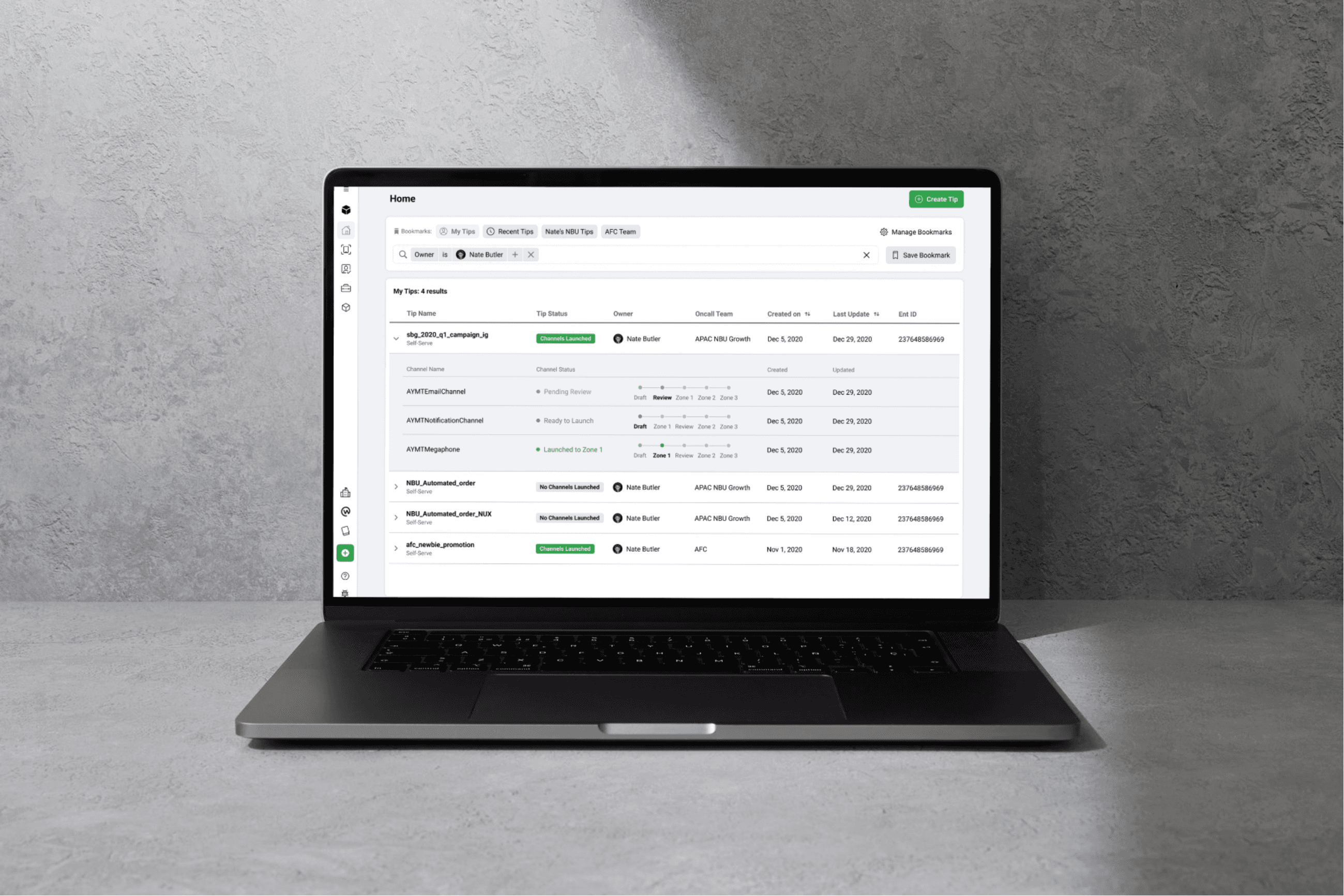
Restructure Navigation and Visualize Status
Rebuilt around a centralized dashboard that shows granular launch progress, enabling efficient management of notification cycles. The restructured navigation also lets engineers scale new features efficiently going forward.
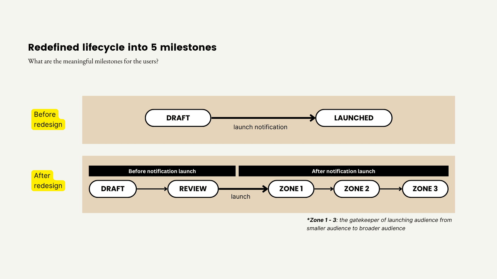
Redefine Notification Lifecycle
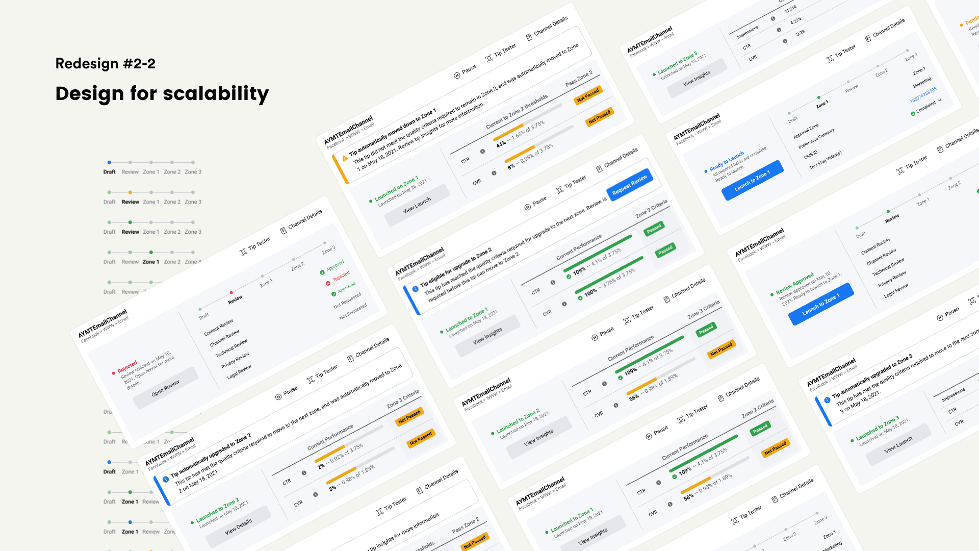
I redefined the status model from 2 states to 5 milestones, and made the case to invest in the backend changes it required. The new model used color-coded status bars for visual tracking, guiding users toward the next action at each stage.
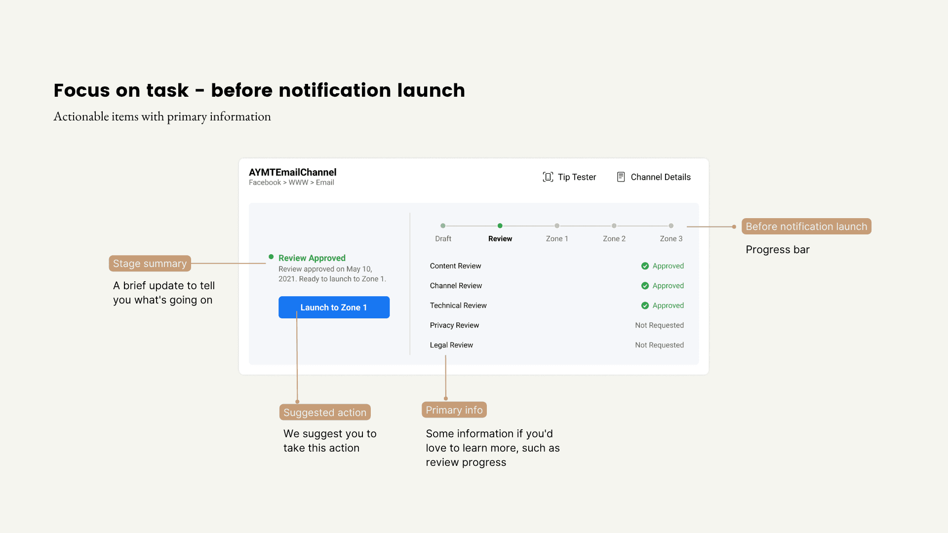
Task-Oriented Card Design
To give users a clear next step at every stage, the redesigned information cards focus on the task at each milestone, surfacing a call-to-action button alongside the information needed to complete it.
I built the system around three principles. Component specs, including sizing, elevation, and spacing tokens, were documented so engineering could implement without guessing.
Scalability: a flexible structure that could absorb future tabs and use cases without rework.
Consistency: one card module reused across the homepage, launch details, and review details, so the same information reads the same way everywhere.
Coverability: defined states for every stage a notification could be in, including edge cases like automatic upgrades, downgrades, and pauses.

Embracing Bold Visions While Gaining Small Wins
If I revisited this today, I'd still start with small fixes, since that's a reasonable way to get familiar with the project. But as design lead, I'd push for the product vision in parallel earlier, instead of waiting until the team had fully ramped up. Helping the team see that urgency sooner is what would have gotten the vision built in week one instead of week eight.
In the first two months, I doubted small iterations could fix the platform's core issues, but it took that long before I had enough conviction to push past the fixes and propose a bigger vision. The rebuilt platform we shipped together proved the bet was right.
Get the Ball Rolling with Research
The team spent a lot of time learning the system's backend logic, but still lacked the confidence to propose a direction, because no one had thought to look at user behavior data yet. By initiating a UX audit and journey mapping, I quickly uncovered valuable insights and energized the team. This experience taught me that kicking off research is the best way to navigate ambiguity, find opportunities, and bring the team together.
Leading Impactful Collaboration
A key takeaway was the unexpected benefit of the user collaboration model I developed. Regular design check-ins with heavy users for feedback led to engineers reaching out directly, fostering a close-knit collaboration that significantly benefited development. This experience showed me how strong relationships between users and the development team can greatly impact product success.